Outdoor Advertising is a distinct medium and creative messages should be specifically geared to this format. Your message is extremely important to the overall success of your campaign.
Please review the following guidelines and consider them for your display design.
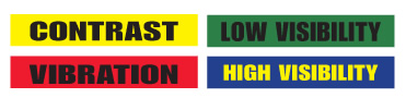
High Contrast
If you want high visibility, high contrast is the key.
It's More Effective to Make a Small Object Large
(Like a wristwatch) than to make a large object small (like a building).
Use High Resolution, High Quality Images
Images for billboard use should be very carefully selected. After all, this image could end up being over 48 feet wide! Defects in the image will be magnified at this large size. Resolution is also very important. Low resolution images (from a website for example) will "pixelate" when enlarged so be sure to use images that have been scanned at the proper resolution (typically above 300 dpi but final sizing depends on printed output resolution and design layout.)
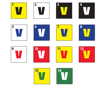
Color Visibility Ranking
Static Color Chart:
The chart below ranks the 14 most visible color combinations, with 1 being the most legible.
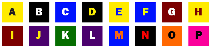
Digital Color Chart and Design Tips:
Keep It Simple
The first step to creating effective messages with your electronic sign is to keep the wording short and succinct.
• Avoid spelling out complete sentences. Don’t use eight words when four will do.
• Stick with shorter, simple words to maximize quick comprehension by motorists.
• A single message idea will read quicker and more easily than trying to combine multiple offers.
Keep It Big
Large text will allow fans to see your message from a greater distance. If your text is too small, it will be too hard to read. Your audience is then likely to disregard your messages entirely. Although capable of much smaller, we recommend a 12” character as a minimum. Three foot text, and larger, would be optimum.
Keep It Clean
Avoid using thin fonts as well as most script fonts. The strokes of each character are simply too thin to maintain legibility over long distances. Use thick, heavy fonts to maximize readability. The bold option is an excellent way to add weight to your wording.

Keep It Colorful
High color contrast is a key ingredient. Just like using large text, the right color combination can make your message readable from a much longer distance. Refer to the samples below for many of the best text color vs. background color combinations for your electronic sign.
File Format
• JPG, BMP or GIF for still image content at 100% quality; Use RGB color, not CMYK.
• Artwork Size and Resolution: 2x the sign’s pixel dimensions at 72 dpi.
Product Identification
Make sure you are able to read the advertiser's name.
Short Copy
No more than 10 words total, and only five words in a headline.
Short Words
Use short words for faster comprehension.
Large & Legible Type
Remember these are viewed from 400 to 800 feet away.
Increase Line Thickness
At 600 feet, thin lines optically disappear.
Bold Colors
Being subtle at 600 feet just means it doesn't get noticed.
Simplify Everything
Focus on one key objective. Don't distract the viewer with multiple messages.
View the Design from 15 Feet
Can you read the copy clearly? This simulates viewing from the road.
Show it to Someone for only 5 Seconds
Did they understand it? This simulates driving past the billboard.
|